Arena offers complete billboard advertisement design and production services to our clients. Some clients, particularly those affiliated with national corporations with in-house marketing departments, provide us with finished ad materials ready to post. Most, however, choose to utilize our design and production service.
Arena typically works with our clients from the outset in developing and producing their ad designs, often beginning at the point they are interested in a billboard ad of their own but haven’t thought it through beyond that. That’s just fine as a starting point.
Arena is experienced in creating everything from initial ad concepts, to design drafts, and through to succinct, vibrant, and highly effective final billboard advertisement designs. Once the design is complete, we work with the highest quality print house in the country to bring the finished design to life on a large scale billboard display. Finally, experienced tradesmen install the advertisement on to the billboard structure itself, and the ad is live. But our job doesn’t stop there. Even after install, Arena maintains the billboard advertising materials on behalf of our client for the life of the ad at no additional cost, ensuring the ad, and therefore the company being advertised, stands strong and proud.
What factors go in to designing a highly effective billboard ad? That is, an advertisement which is readable and memorable to drivers passing by at anywhere from 40 to 80 MPH?
Here are Arena’s top five design tips, which you may use to get started on a billboard ad concept for your company:
1. Keep your message short and simple.
Studies show the most effective billboard ads are seven words or less. Fewer is even better. Avoid complete sentences. Communicate one idea, clearly. Use humor, cleverness, or a call to action in order to engage with your viewer.

2. Limit the ad to three elements.
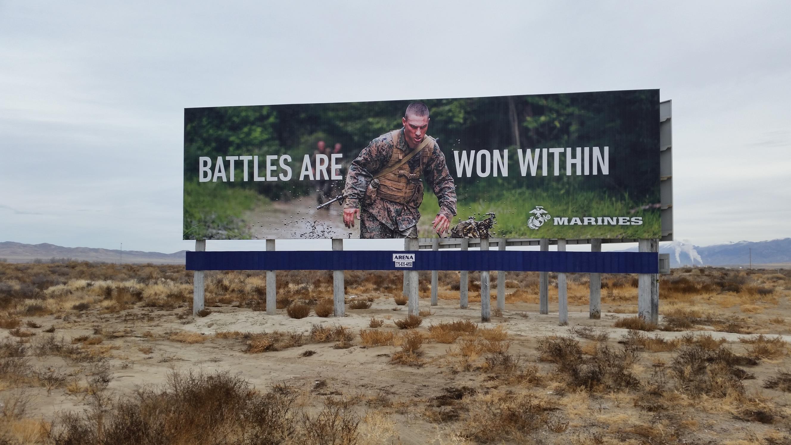
One example might be a large photo/graphic, an action phrase, and a logo.
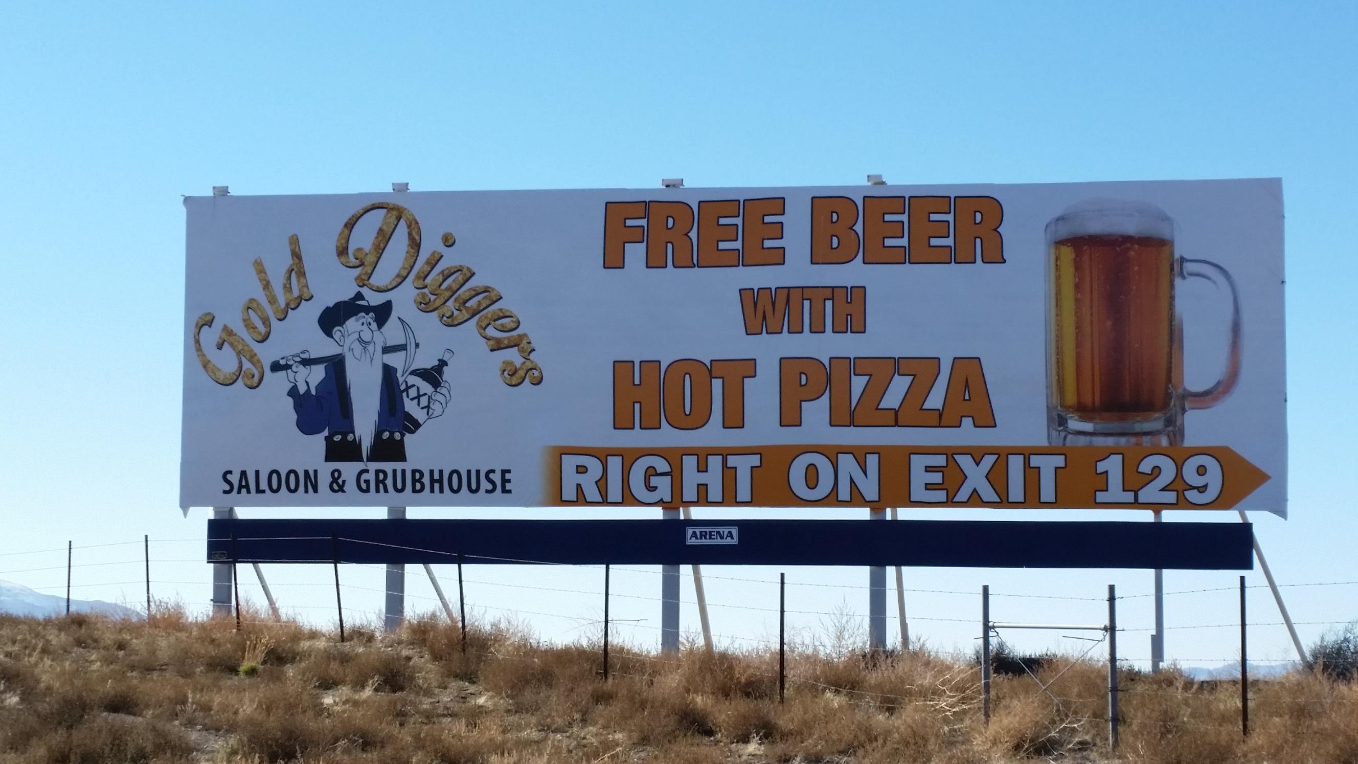
Another example might be a large graphic, a current promotion, and a directional (i.e., “Next Exit”).
There are dozens of potential combinations, and studies have shown ads with few elements are more effective than those with many.
How big should each element be? Try 50% image, 40% call to action/logo, and 10% information (i.e., directions/contact info).
3. Use big, thick fonts.
Thin fonts, cursive script fonts, and the like are legible from shorter distances than block fonts. You want your ad to be legible from as far a distance as possible, so use the large, thick, block type fonts to help with that. As for size, the optimum height for letters/numbers on a typical 14’ x 48’ billboard is at least 3 feet; avoid text/characters smaller than 18 inches tall.

4. Use high contrast colors.
Studies have shown ad recall is much higher when high contrast colors are used on a billboard ad, than when colors are muddled or lacking in contrast. You want to grab attention, which is readily accomplished when contrasting colors are utilized. Black on yellow, white on black, orange on blue, yellow on purple, and green on red are some of the many tried and true color combinations you may want to consider.
5. Never stack more than three lines of text on a design.
Two lines of text would be better, and one line of text is best.

And there you have it, Arena’s top five design tips! In practice, you’ll find it is often difficult to accomplish everything you want to while adhering to these five tips, and the reality is billboard designs don’t always accomplish them all. But keep your eyes peeled, and from time to time you will see a billboard which does. Chances are you will find that design more appealing and memorable than most.
Would you like to get started right now, wherever you are?
Here is a quick exercise. First, brainstorm one or more ideas for your company’s future billboard ad. Think about what you would like to communicate, what you would like to promote, and what graphical elements or logos you would like to feature. Then, draw a long skinny rectangle (3” tall x 10” wide is about right) on a blank sheet of paper, and sketch your ideas into the rectangle (you can also do this in your favorite graphic design program if you prefer, printing the design draft when complete). Hang the sheet of paper on a wall, and stand back 10 to 15 feet to view it. Is it concise and legible? Ask an associate for a second opinion if you’re not sure. If the design is difficult to quickly read and understand, go back and change things up using the above tips, until you get to a concise design which is clear and effective at a glance. After this short exercise, you’ll be well on your way to a highly effective billboard advertisement of your own.
Are you ready for the next step? Or, are you stuck with your design and in need of assistance?
Call Arena at (775) 835-4250, where we love everything about designing and producing billboard ads, and will be excited to help bring your ad to life!
